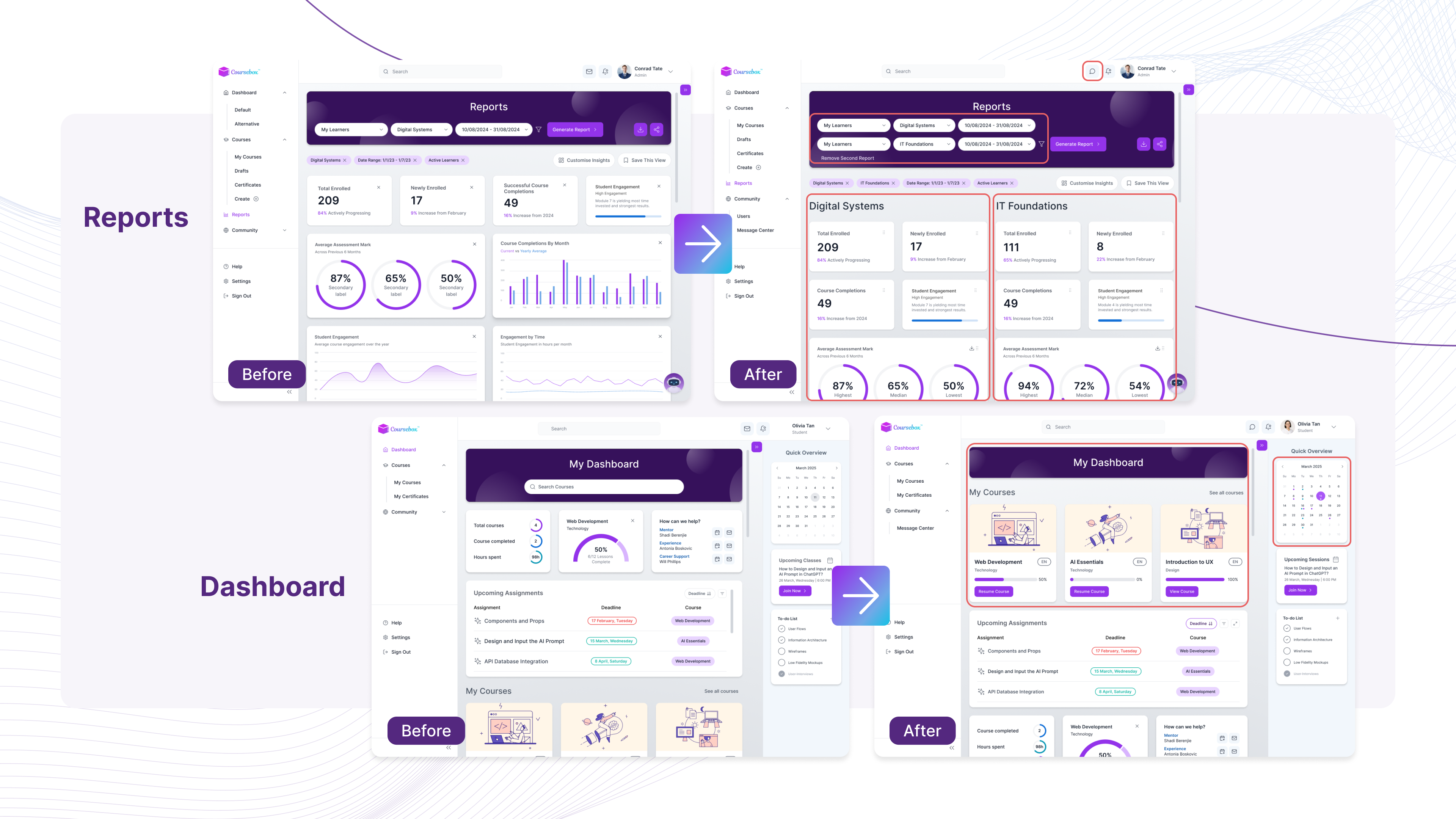
Coursebox's dashboard left admins and learners frustrated there was too much noise, not enough signal. We redesigned the reporting and dashboard experience to surface what actually matters, for two very different users.
The Problem
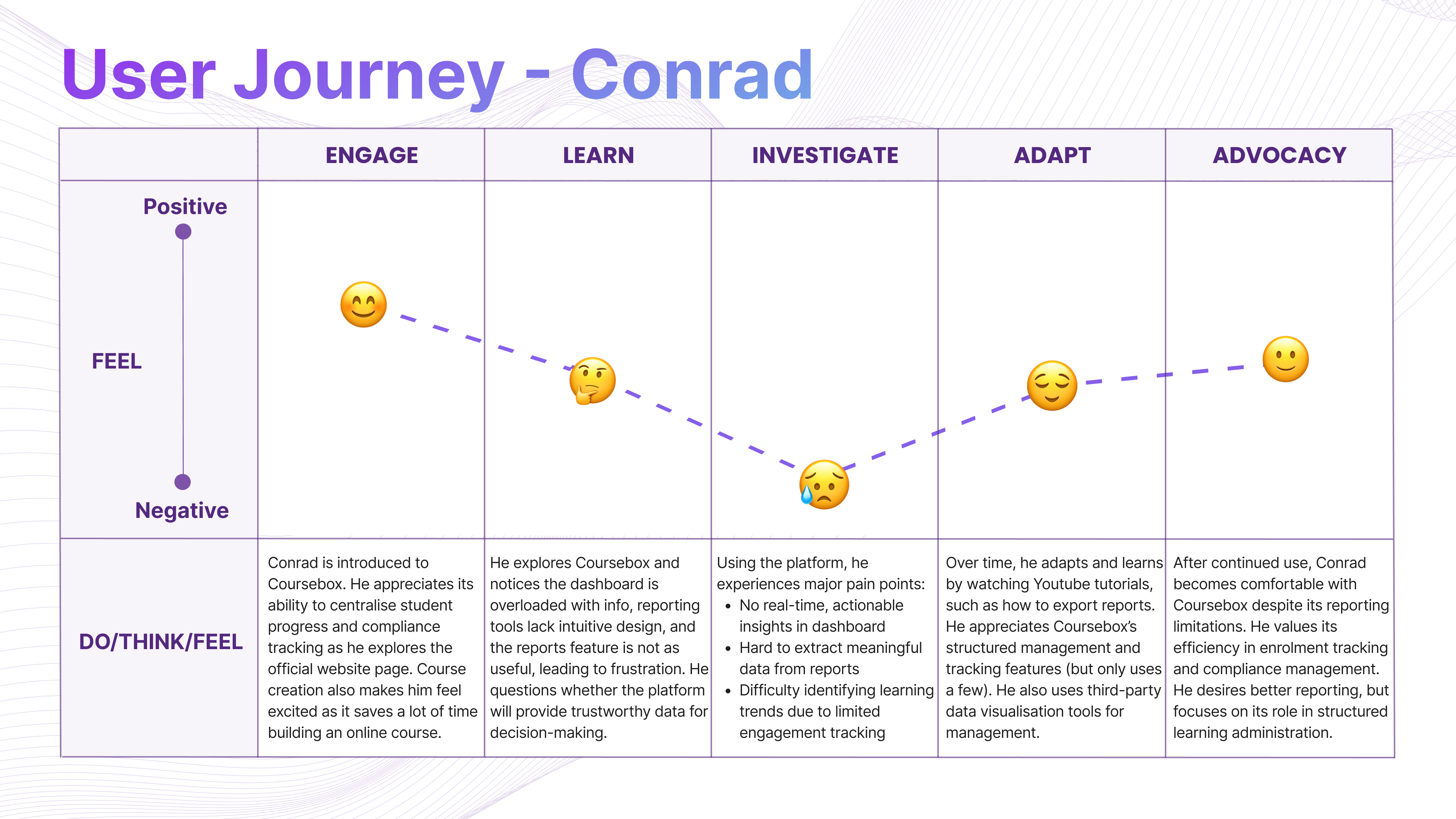
The platform lacked real-time insights and meaningful data. Reporting tools offered little filtering, forcing users to hunt for critical information.
Research
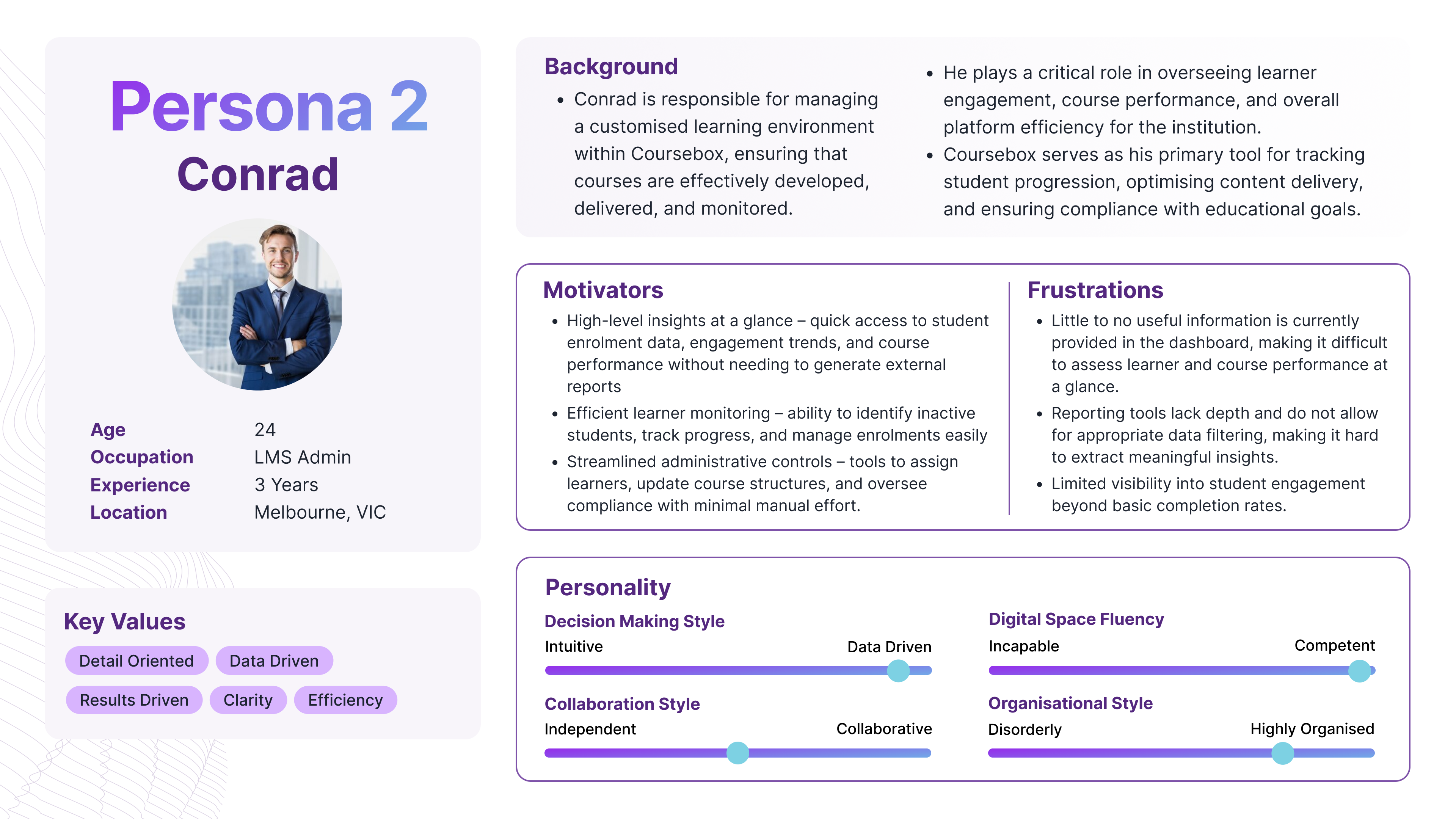
Deep diving into two main personas - learner and LMS admin, both hit the same frustration point: data the platform simply didn't surface.
Process
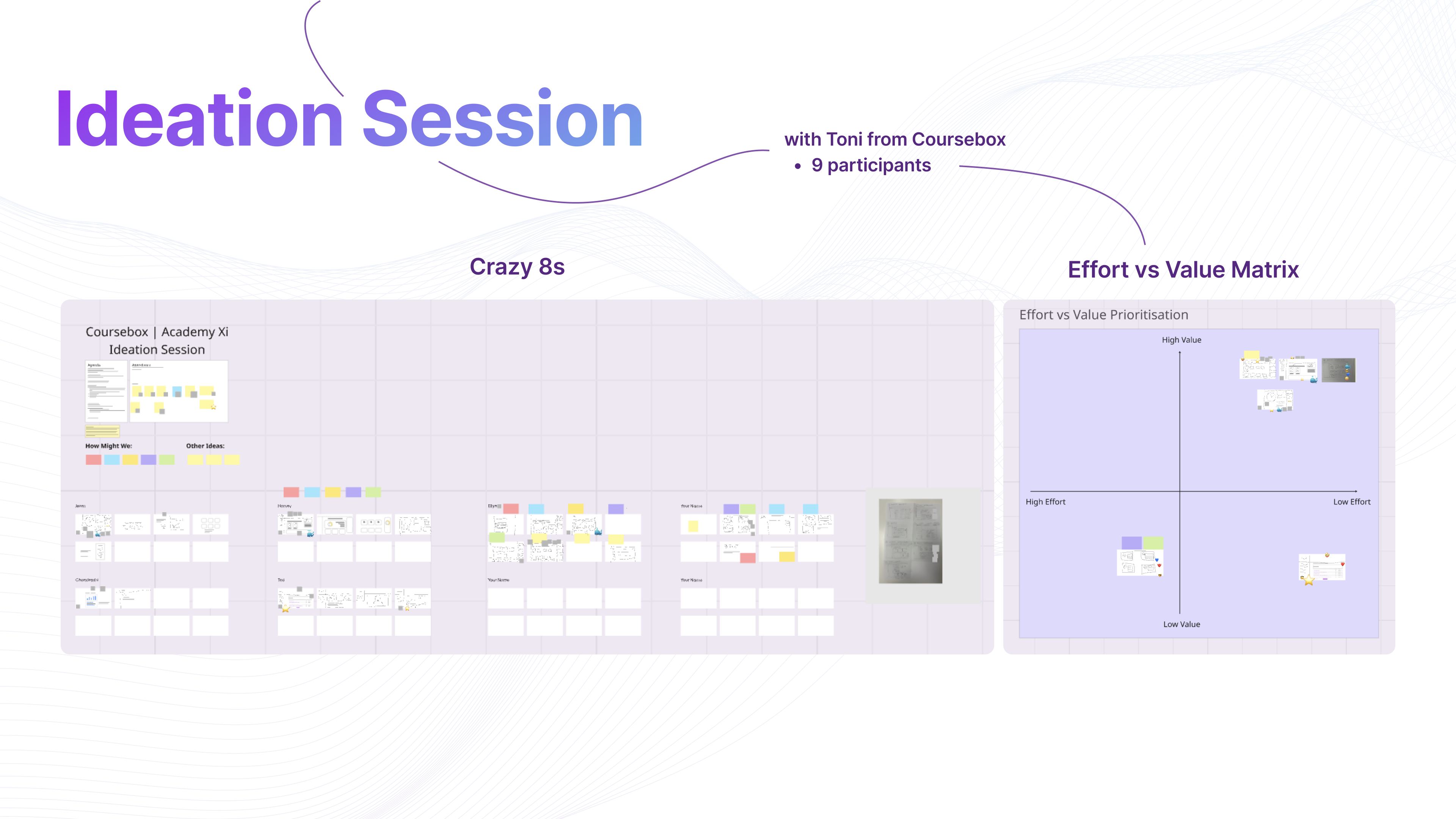
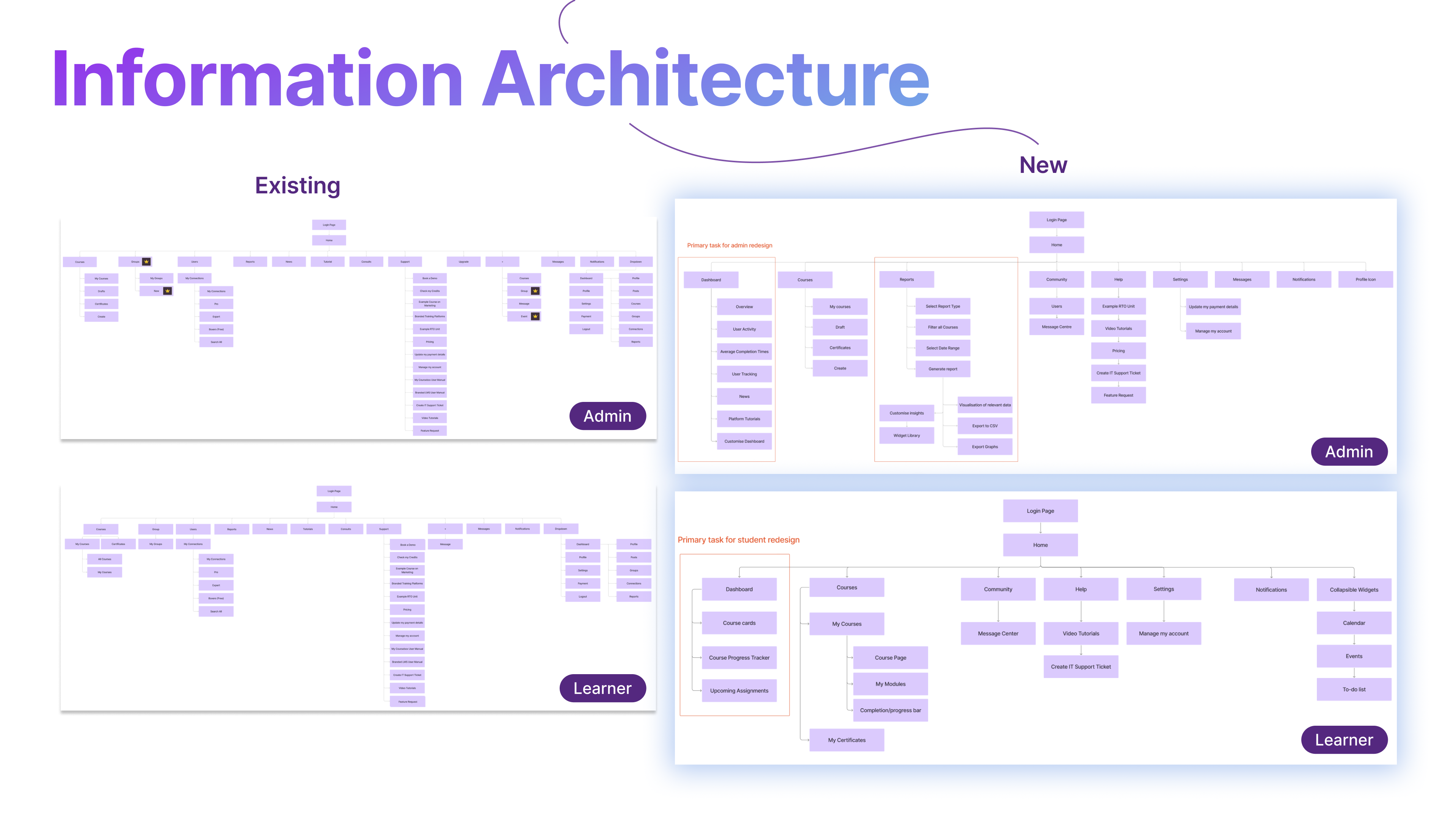
Crazy 8s ideation with the Coursebox team, effort vs value prioritisation, restructured IA and a full design system built from scratch.
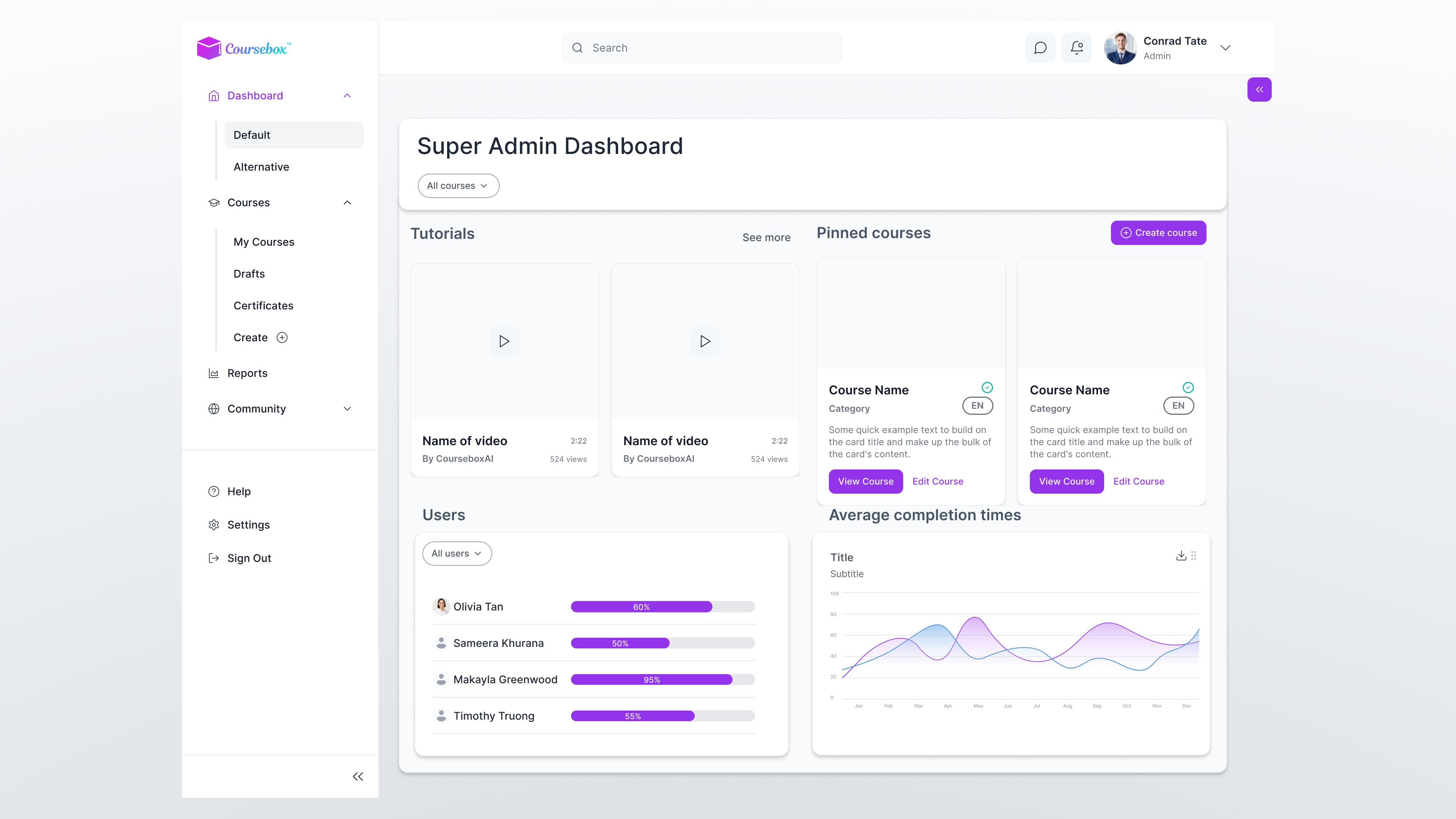
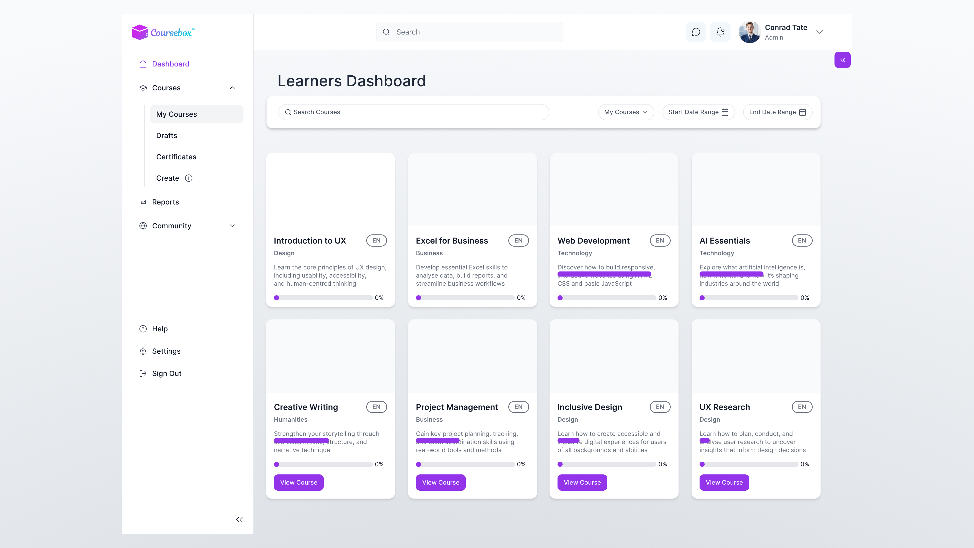
Outcome
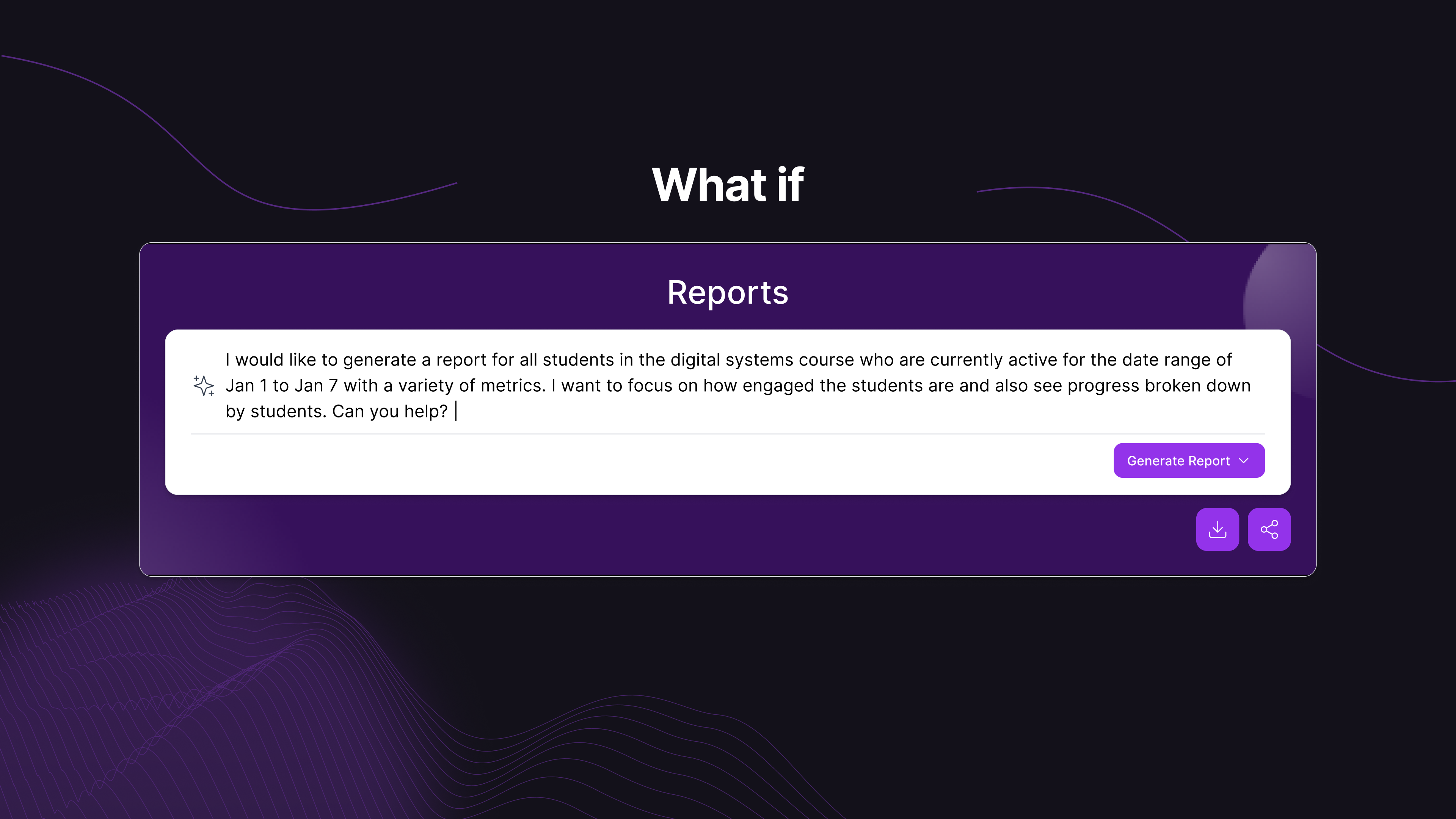
A redesigned Admin Dashboard with at-a-glance enrolment data and completion trends. A personalised Learner Dashboard with progress tracking and upcoming assignments. Plus a speculative AI report generator concept.